Case study
MIT Technology Review’s EmTech MIT
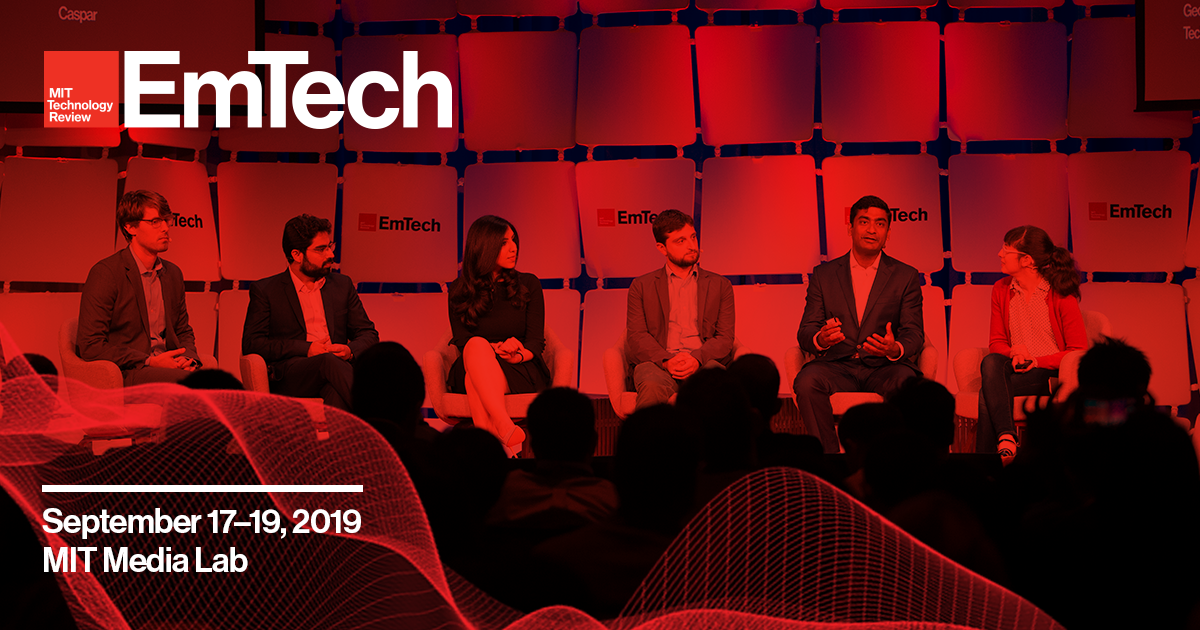
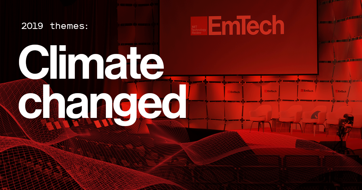
MIT Technology Review’s EmTech MIT is a three-day conference bringing together world-renowned innovators and business leaders for intimate conversations on the year’s breakthrough technologies at the iconic MIT Media Lab.
Following the company’s rebrand with Pentagram partner Michael Beirut, I was in charge of updating the look and feel of the entire events portfolio, starting with EmTech MIT, the flagship annual conference.
Disciplines
Art direction, branding, content strategy, copywriting, design, motion design
Deliverables
Brand guidelines, print ads, banner ads, landing page template, email templates, Powerpoint templates, on-site signage and collateral
Collaborators
Eric Mongeon
Work done while in-house at MIT Technology Review.
Background and research
The EmTech MIT conference had gone through many brand iterations throughout its history, and its latest one built heavily on the past: the trademark red color and square brick were to remain.
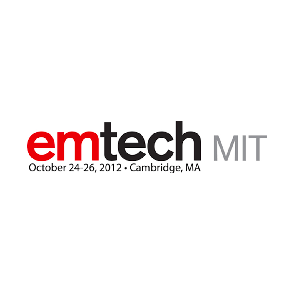
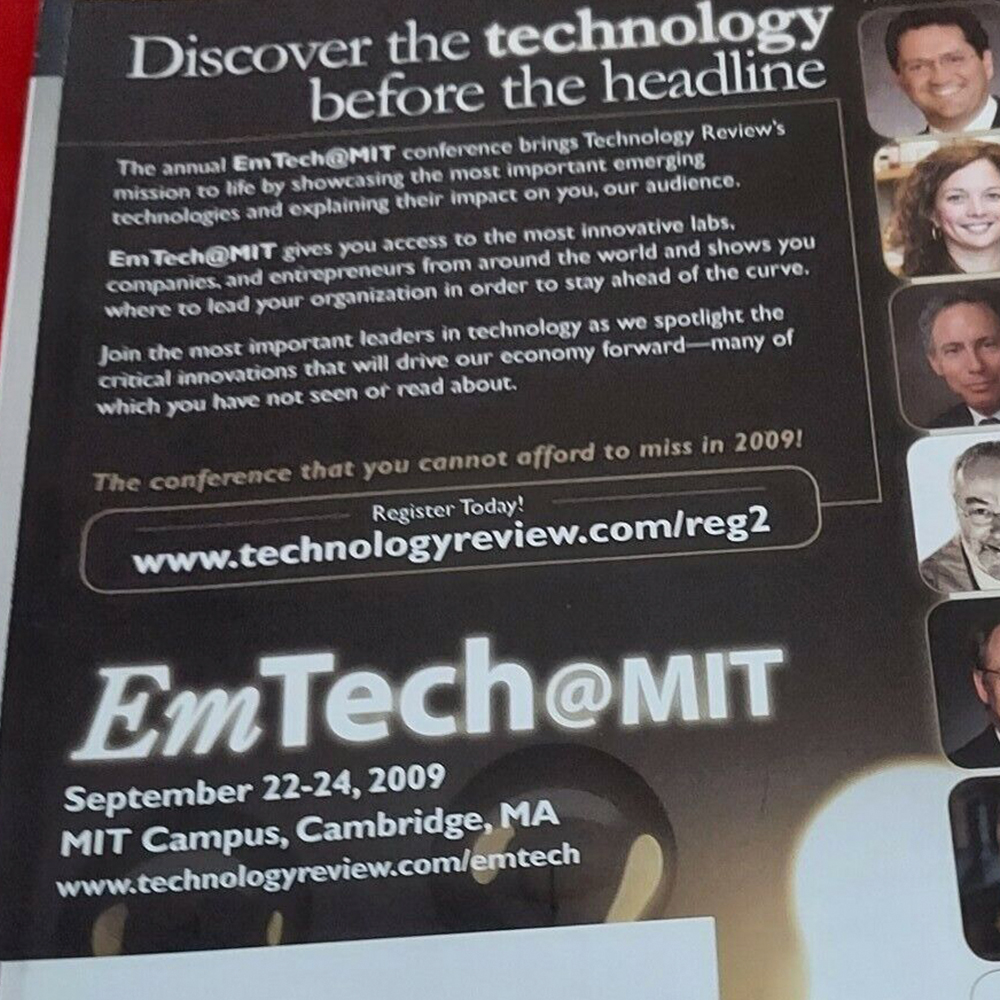 Examples of older creative
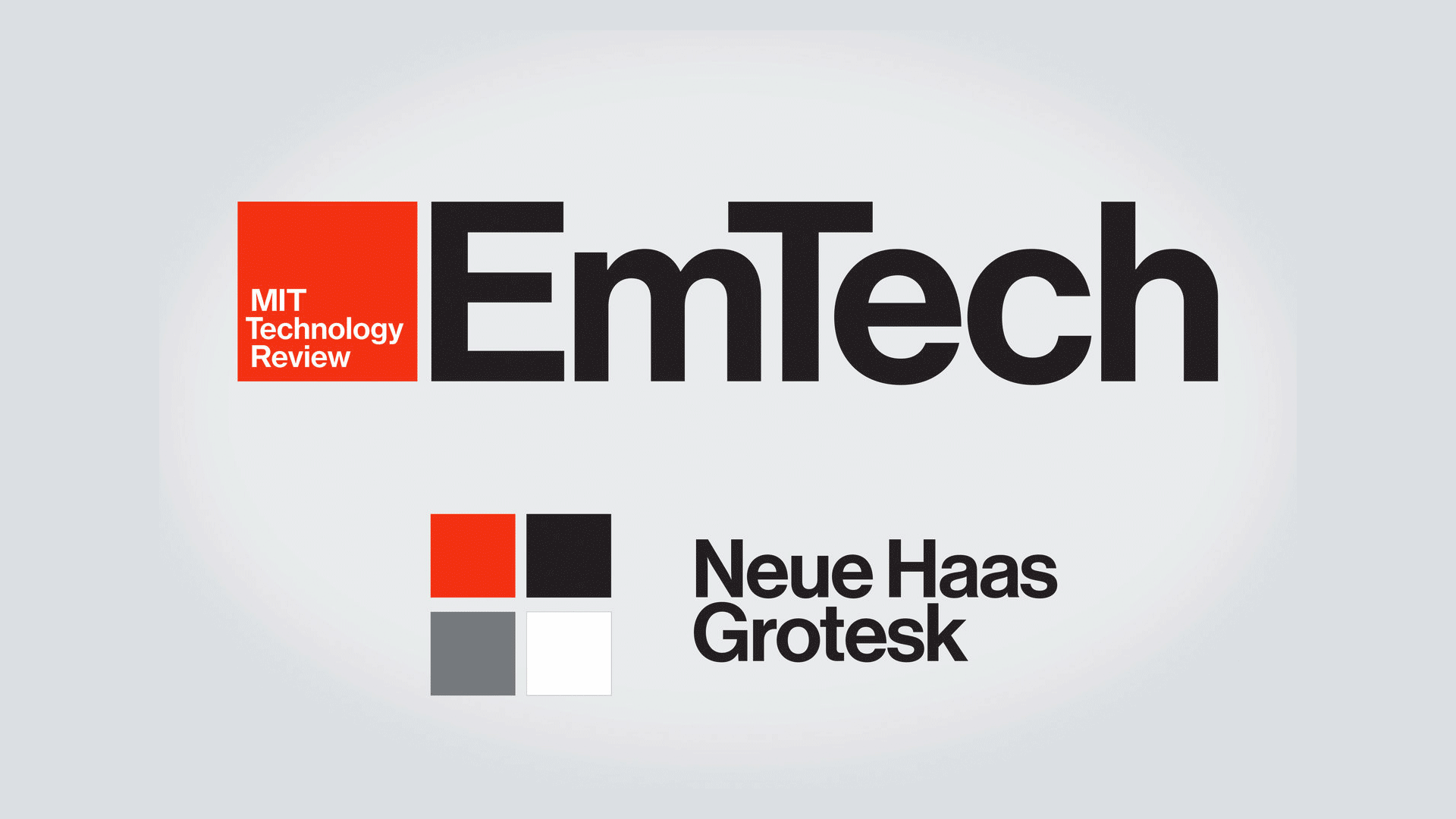
As a starting point, I gathered the elements that already existed and would not change: The logo (updated to coincide with the rebrand), the color palette, and the new institutional font.
 Existing creative assets
Enter the wave
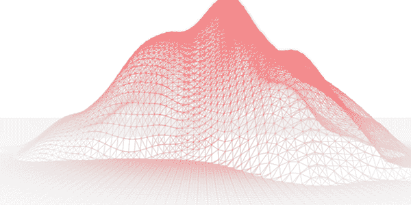 The animated EmTech Wave
To these, I added a new element: The wave. The EmTech wave represents the ever-changing and evolving technological landscape and the conference’s place at the forefront of these emerging technologies. It adds further visual distinction to the above set of givens, and to function as a mnemonic across all executions of the brand.
A palette of static waves was created to give a visual diversity to print communications, and it also appears in motion digitally.
After the wave
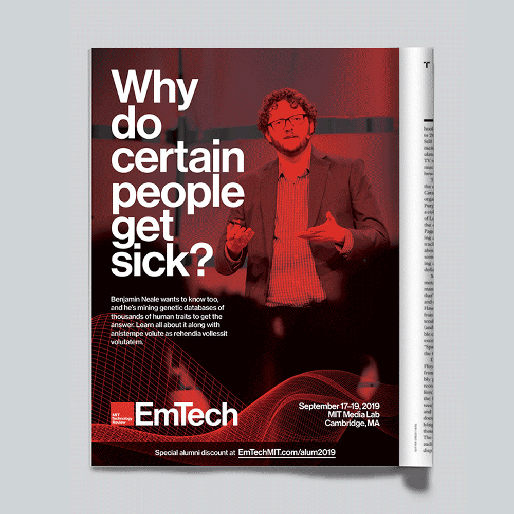
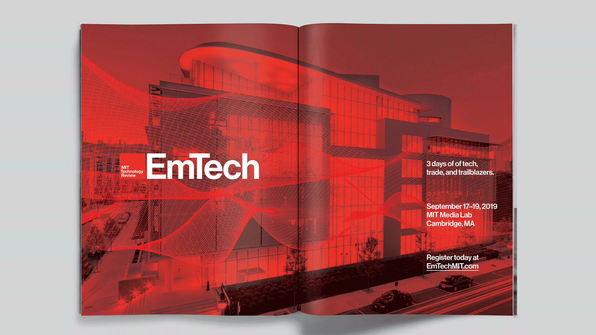 Magazine spread advertisement
With a solid toolbox of elements decided upon, I was able to execute a suite of distinctive and impactful collateral and advertising assets. By applying a simple color wash, photos that come from various sources now work together seamlessly as parts of a singular family.
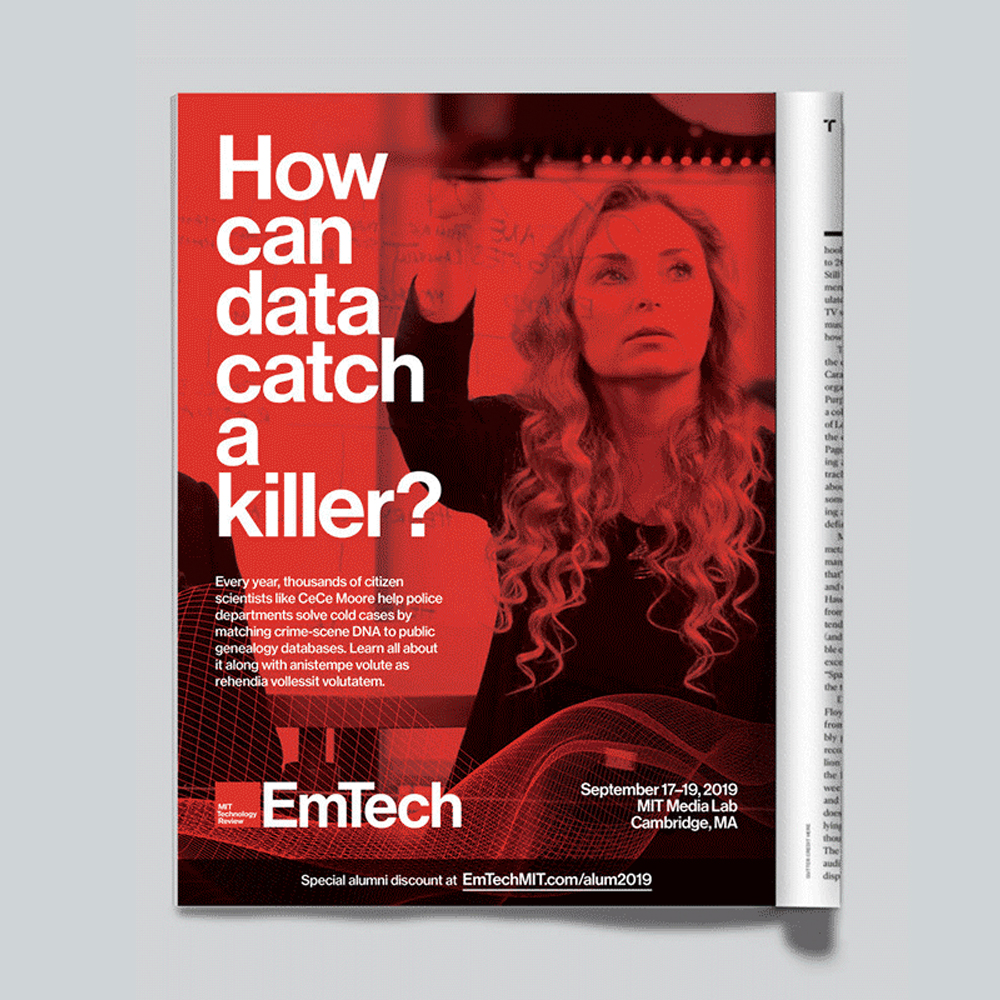
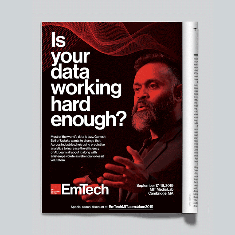
 Magazine advertisements
“Kyle standardized the look and feel of our designs, and he created assets that were user-friendly and allowed us (a team of non designers!) to scale and update as needed.”
—Nicole Silva, MIT Technology Review Director of events
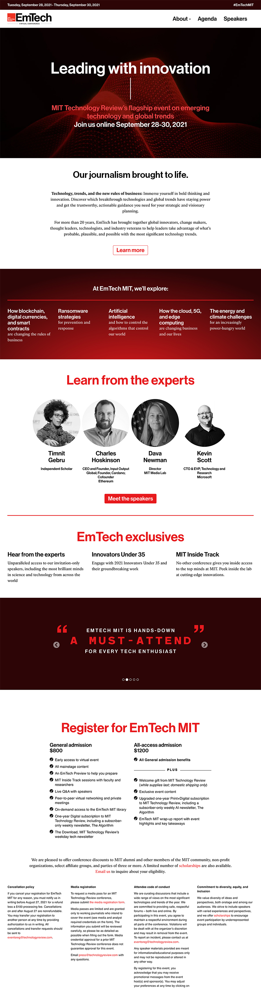

The website template was completely overhauled, putting more of an emphasis on acquisition of new attendees instead of its previous focus on the education of already-converted ticketbuyers. New attention was also placed on the mobile expression of the website to make it an equally compelling experience to that on desktop.
Content that is only of value to future attendees (e.g., venue information, detailed agenda information) was de-emphasized or moved to sub-pages, and content of value to the as-yet unconverted (e.g., thematic language, star speakers, pull quotes) was put at the forefront. The ticket-buying experience was also made more clear.
 Social tiles
 Animated logo
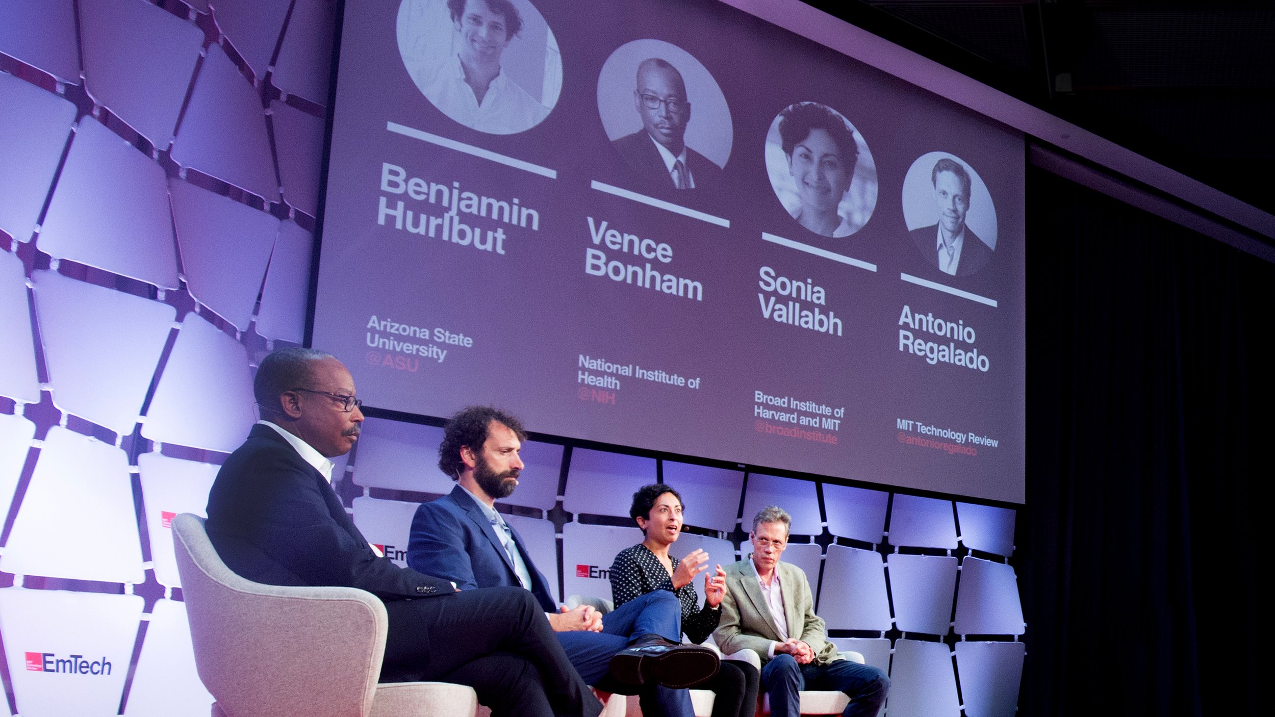 Projection design
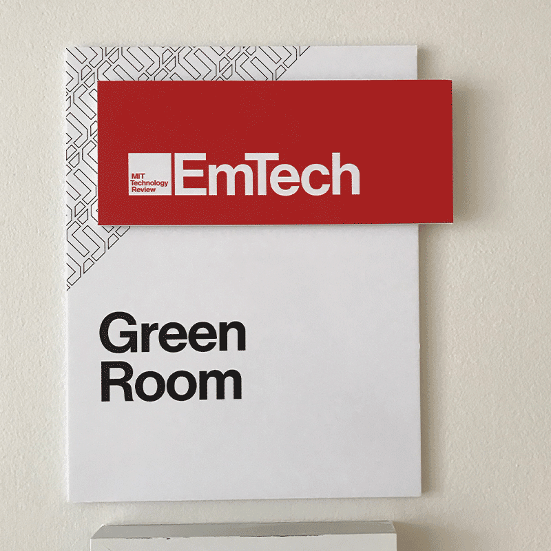
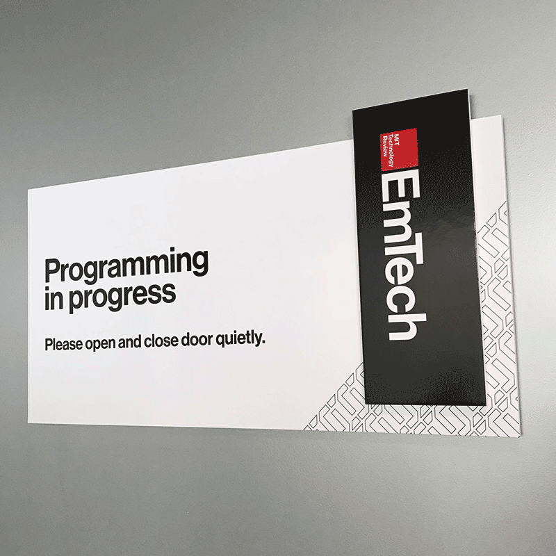 Onsite modular signage system
Conclusions
Following the launch of the new EmTech brand, social media impressions and website visits for the event hit record highs.
The success of this event’s branding was expanded to the other events in MIT Technology Review’s portfolio: EmTech Next, EmTech Digital, and Future Compute; and localized brand standards guides were developed for international presenters of versions of all of these events around the globe.