Case study
Bridge Repertory Theater of Boston
The Bridge Repertory Theater of Boston was founded in 2012, dedicated to the captivating connection formed between live actors and live audiences. It led an itinerant life among several venues with no coherent visual identity providing a throughline.
I was engaged ahead of their fourth season to overhaul their brand and help it further reflect the professional and original quality of their programming.
Disciplines
Art direction, branding, copywriting, design, project management
Deliverables
Brand guidelines, print ads, banner ads, email templates, on-site signage and collateral
Collaborators
Laura Sullivan
Background and research
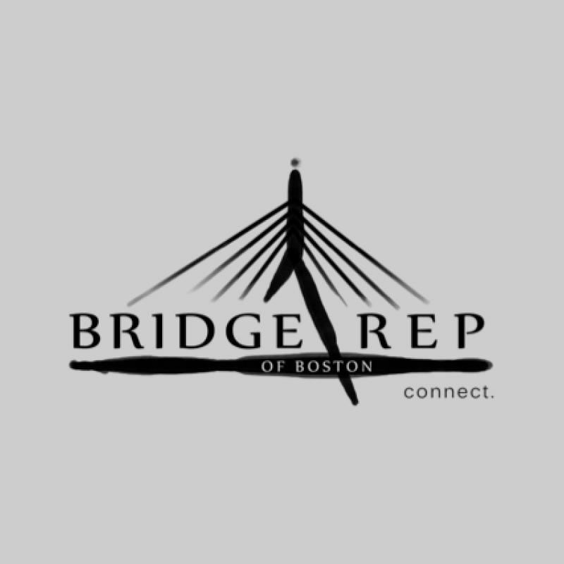 Original logo
The company’s logo for their first three seasons was an illustrated version of the Leonard Zakim Bridge in Boston. Their artwork from show to show varied widely in style and tone, and their visual communications lacked consistency.
Without a “home” venue to produce in or other recognizable identifier, the company needed to more strongly leverage its visual brand to build that familiarity with audiences. As I said in my proposal to the company, “it’s time to stop using someone else’s bridge and build your own.”
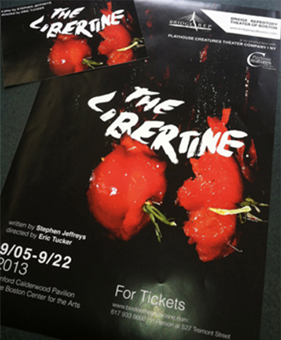
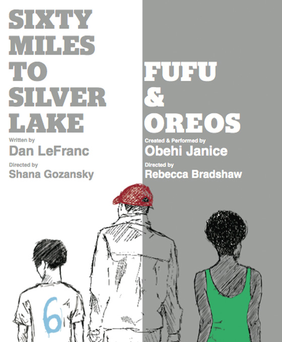
 Examples of show creative
A new bridge
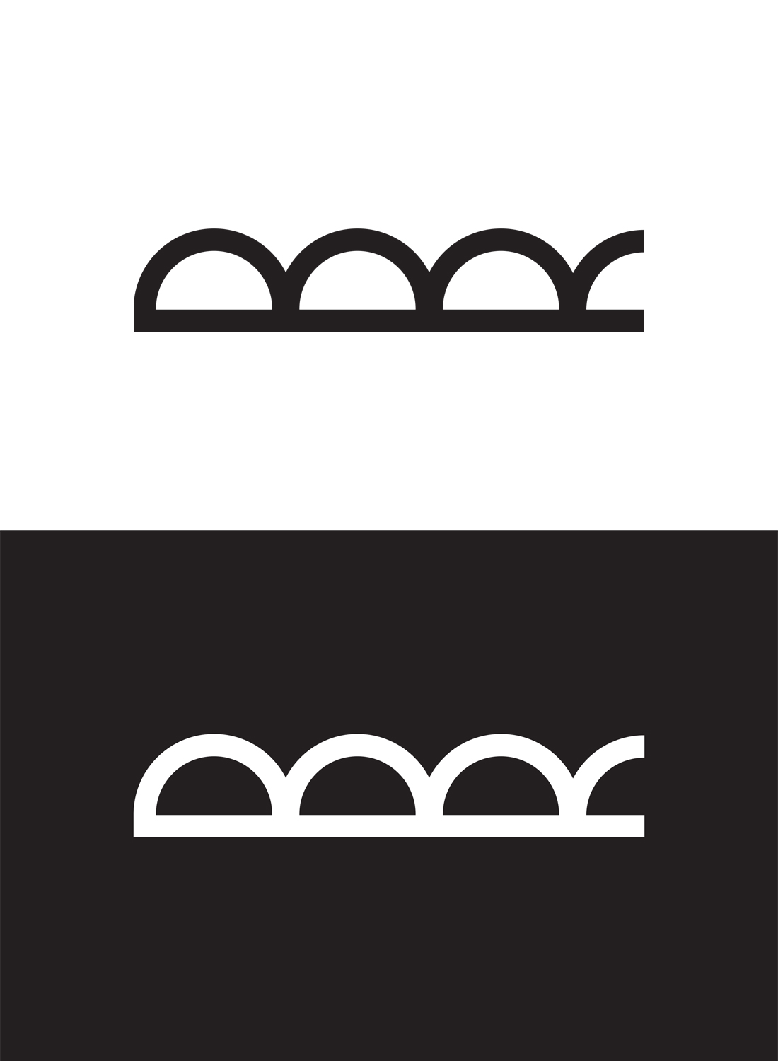
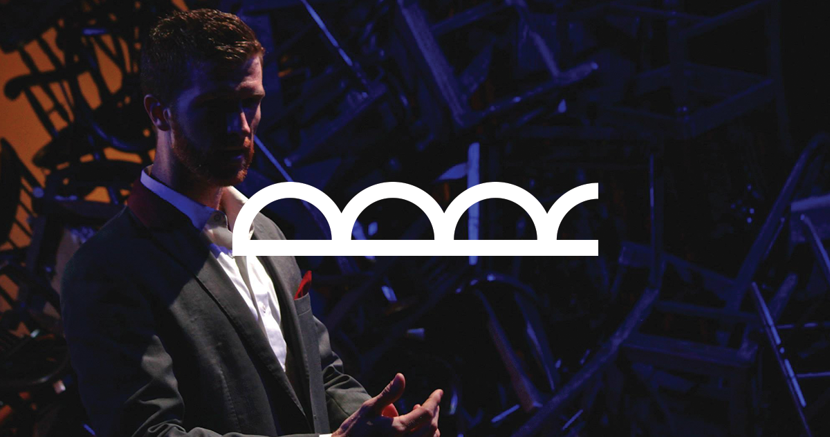 The new Bridge Repertory logo
The new Bridge Rep logo represents many different yet familiar things at the core of the company:
It’s a bridge. Reminiscent of iconic imagery as early as the Roman acqueducts yet clean, modern, and unfussy; the new logo demonstrates the timelessness of Bridge Rep’s repertoire—from classics to world premieres.
It’s still under construction. The final arch of the bridge is incomplete, representing both the impermanent nature of Bridge Rep’s work as well as demonstrating its place at the forefront of creating the future of the theatre.
It literally contains the company’s name. Turned 90° clockwise, the bridge becomes a vertically stacked capital B and R.
Standards were developed for the logo mark as well as typographical conventions, which became the core of the visual brand.
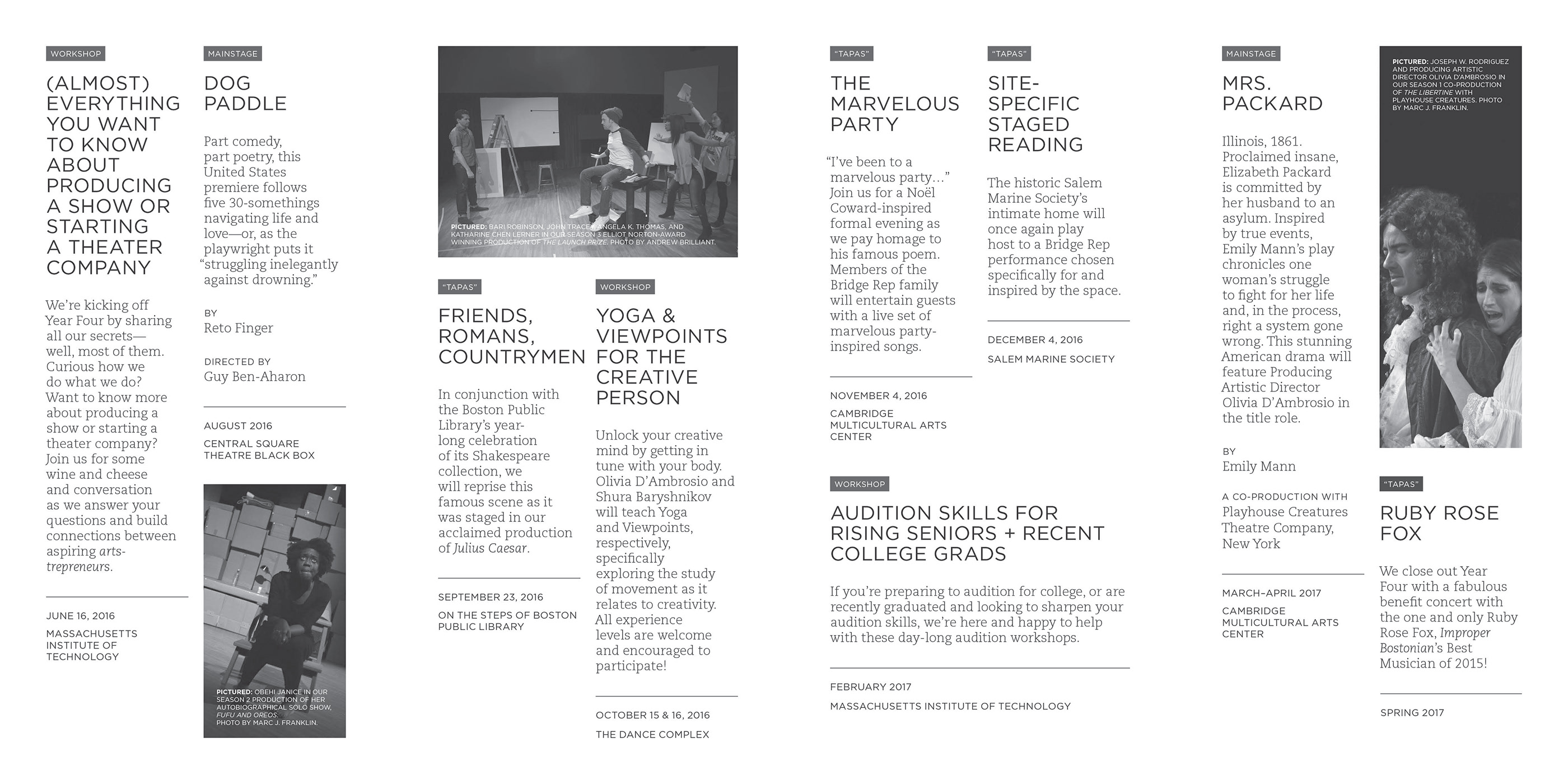
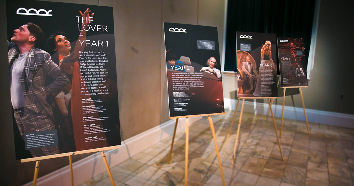 Posters outlining past seasons
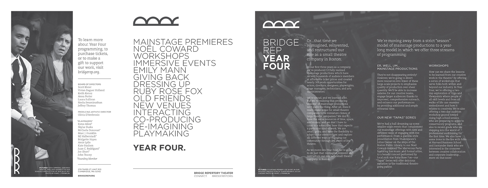 Sample 1-color brochure spreads
“Working with Kyle on this rebrand was an absolute pleasure. He was dedicated, intelligent, and brought creative solutions to our unique situation.”
—Laura Sullivan, Bridge Rep public relations representative
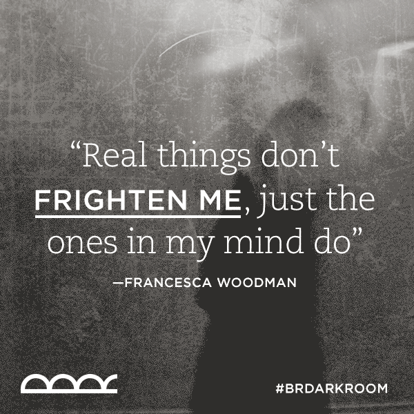 Social media quote graphic
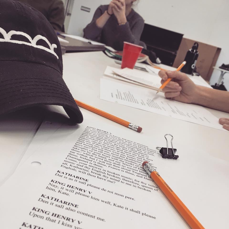 Baseball cap at rehearsal

 Postcard template
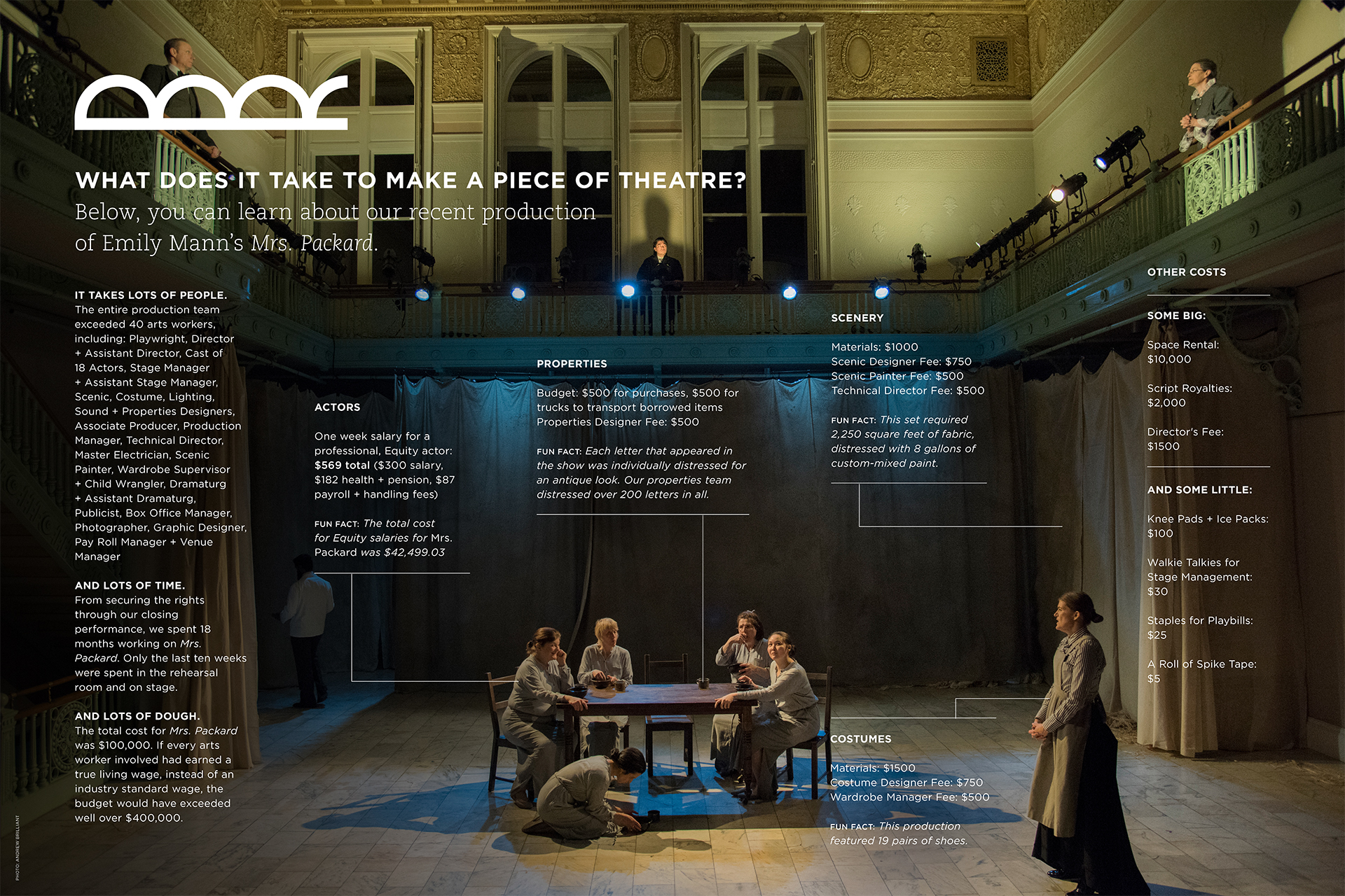 "Anatomy of a scene" fundraising poster
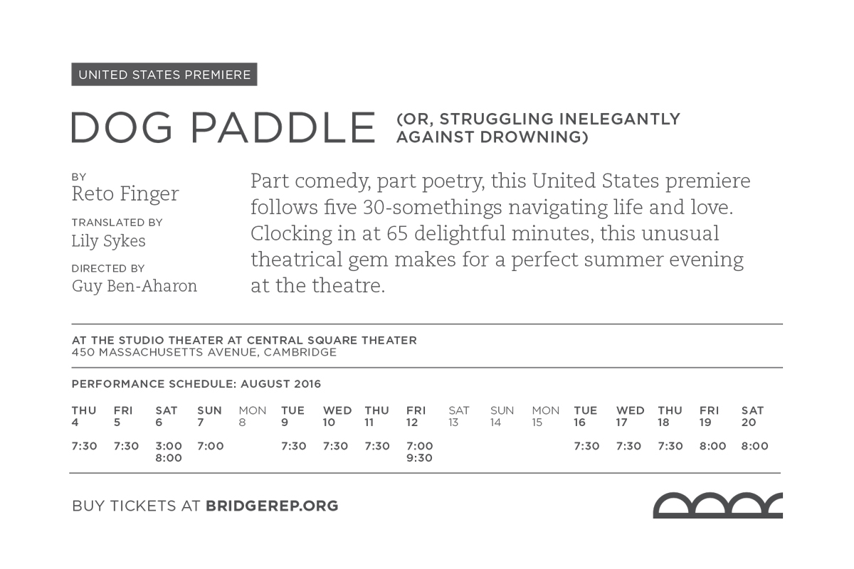
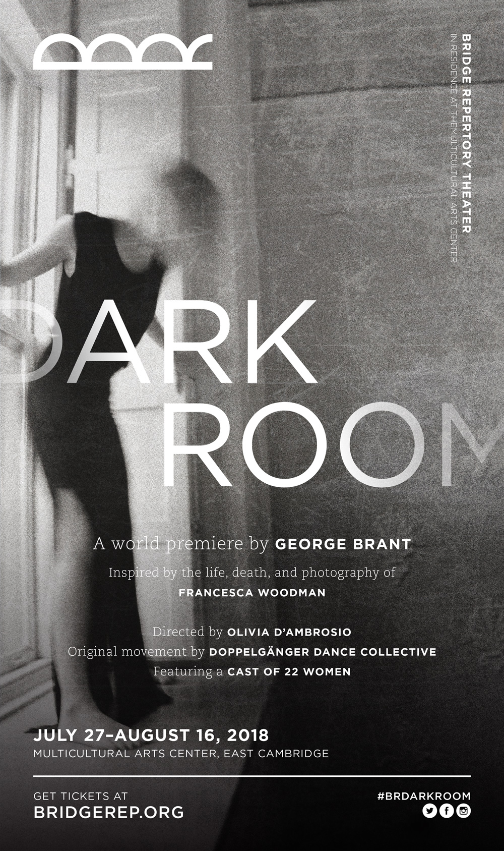 Show poster
Conclusions
This rebrand represented a quantum leap forward for the organization, coinciding with their first major capital campaign. A year later, they announced a residency in Cambridge’s Multicultural Arts Center. Their brand as a rebellious group of artists reinventing the way Greater Boston makes theater, bolstered by their sleek visual identity, earned them accolades and critical acclaim.
The ensemble went on to produce world premieres and immersive hybrid theater/party events until it disbanded in 2019.