Case study
ArtWeek Boston
Founded in 2013 and modeled after Restaurant Week, ArtWeek Boston is a bi-annual collection of events and experiences throughout the city that highlights the quality and diversity of arts, culture, and creative community in Boston.
Launching the brand identity for ArtWeek was no small task—its inaugural fall celebration had over 75 events. I was tasked with developing an inclusive and easy-to-use brand for all presenters to implement.
Disciplines
Art direction, branding, copywriting, design
Deliverables
Art direction, brand guidelines, print ads, banner ads, email templates, digital billboards, on-site signage and collateral, website
Collaborators
Samantha Burns, Long Haul Films
Work done while in-house at the Boch Center
Background and research
ArtWeek’s goal was to democratize creativity throughout the city of Boston through events that partnered artists with local businesses. I began my process by researching other arts festivals, specifically multi-disciplinary ones, to see how they handled the breadth and diversity of their events.
It became quickly apparent that the best way forward was to highlight the individual events and creative partners via imagery and let the branding act as a “frame” for them.
 Mood board
Unleash your creativity
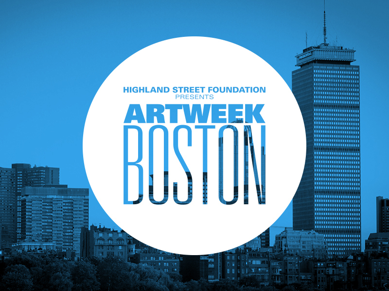 The ArtWeek Boston logo
We arrived at the “ArtWeek button.” This clean, type-forward visual approach could be tagged onto any imagery to indicate its participation in ArtWeek without being too intrusive, while being a bold and legible statement at any size. When not promoting individual events or genres, the city of Boston itself defaulted as the main imagery.
Clichéd representations of art-making were rejected for a clean, type-forward visual approach for the logo. If ArtWeek was celebrating the diversity of the creative community, we couldn’t allow its visual representation to impose any limits (e.g., drama masks, paintbrushes, etc.).
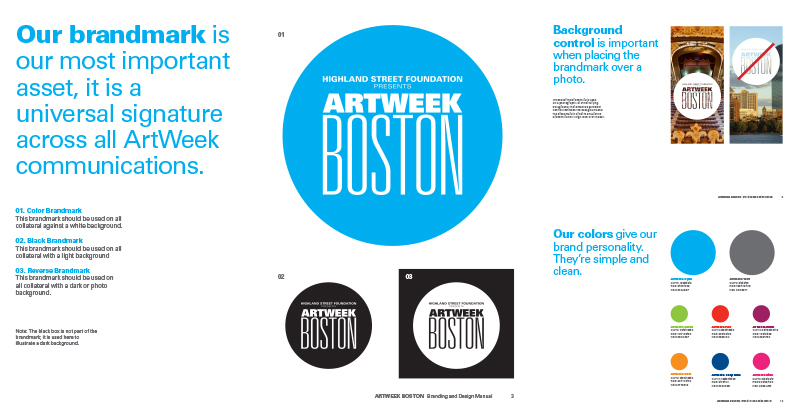 Brand standards guide
Since the system would be used by many people presenting their own ArtWeek events, a detailed identity standards manual and assets toolbox were developed to guide other designers creating ArtWeek communications.
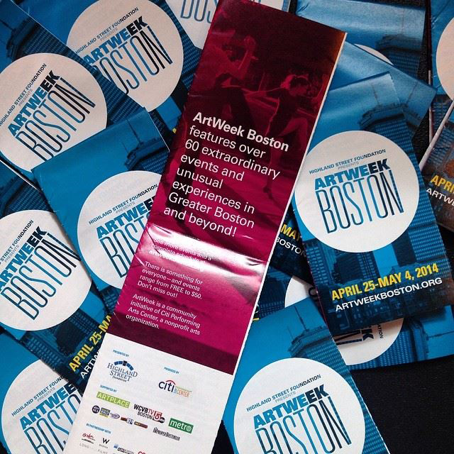 Pocket calendar
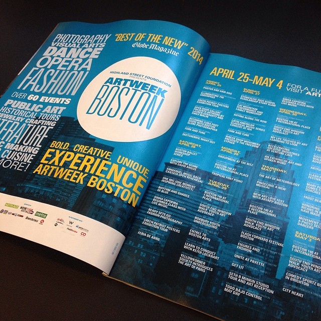 Magazine ad
“How do you encapsulate everything that art is and brings to a community? A seemingly daunting task. In creating this brand, Kyle went beyond the conventional, expected interpretations of art and created a thoughtful, dynamic system that withstood the test of time.”
—Samantha Burns, ArtWeek Boston project manager
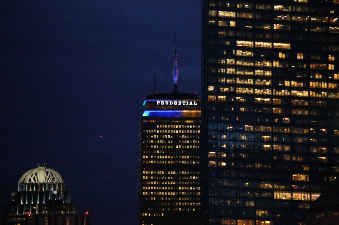 (Photo: ABR Photography & Design)
Boston’s iconic Prudential Center tower was even lit up in the brand’s colors for the launch of ArtWeek’s spring 2014 edition.
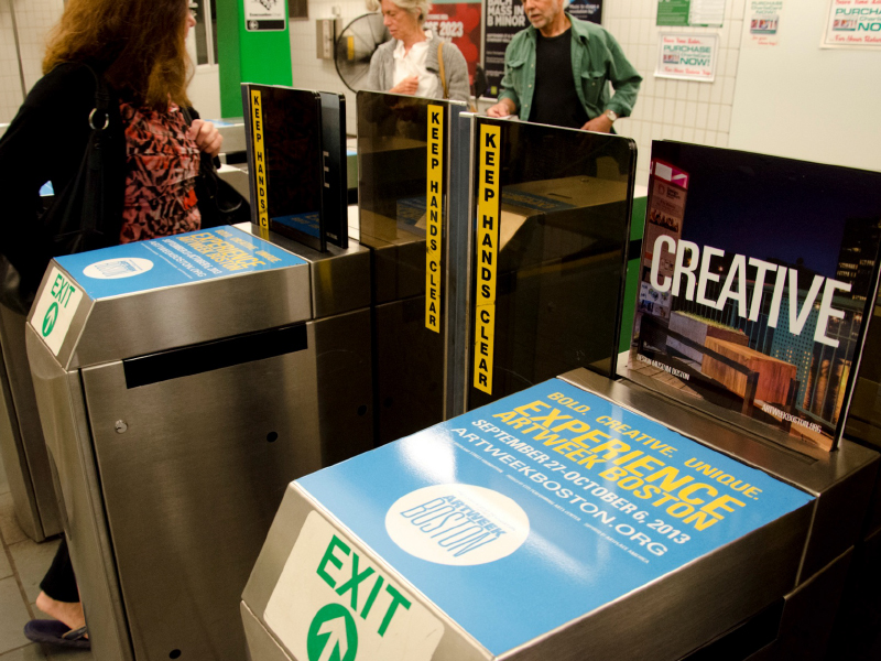 Subway turnstile ads
Conclusions
After its launch, ArtWeek Boston continued to grow through more communities, disciplines, and industries. The brand strategy grew and adapted to shift its focus from introducing the concept to promoting individual events.
The iconic button logo and bright ArtWeek blue color became instantly recognizable as more and more events were added to future iteraitons of the festival, eventually expanding statewide and rebranding as ArtWeek Massachusetts.